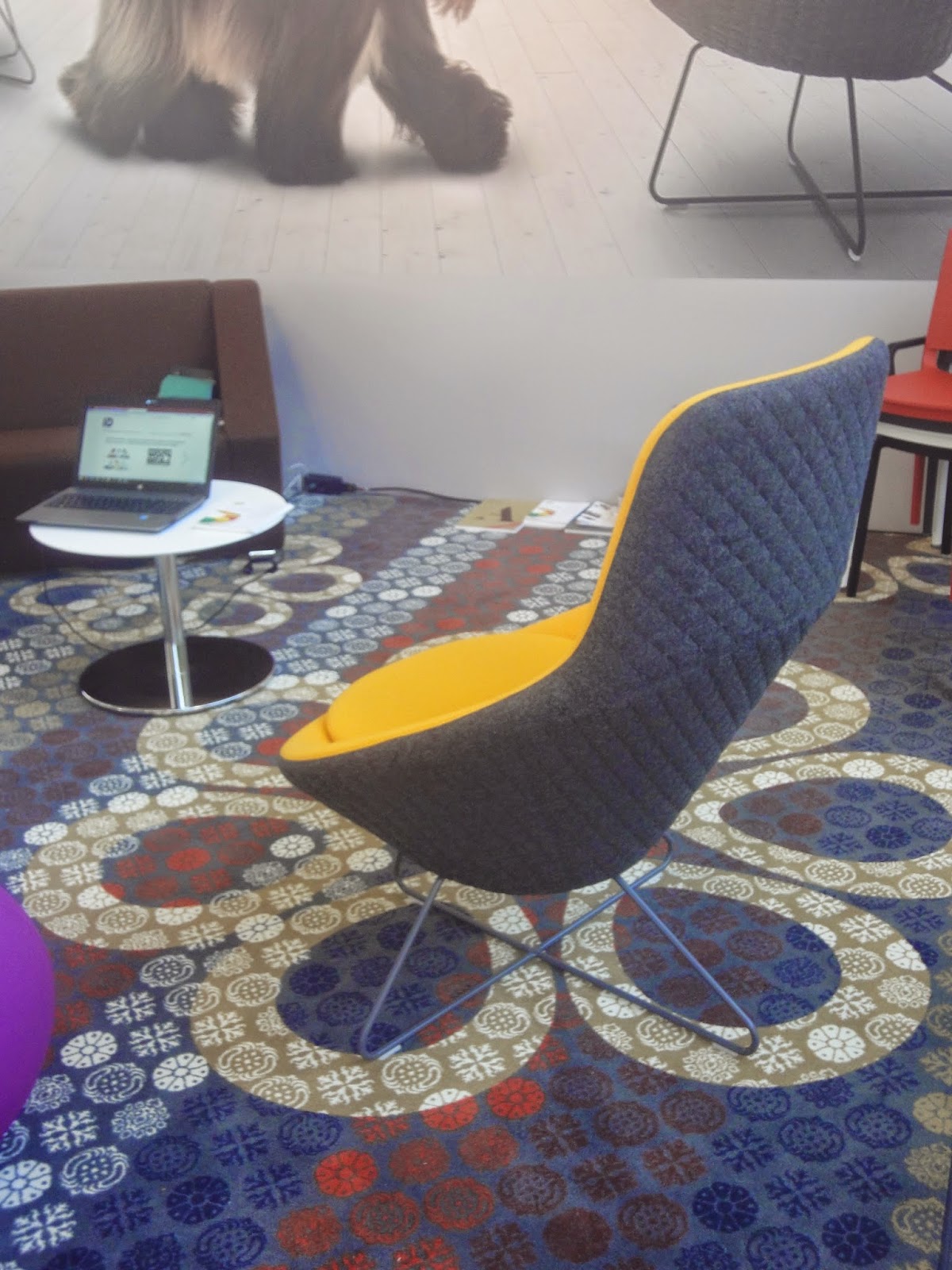
A rather simple girl is called a ‘doos’ (literally translates to box) in Dutch. I have a box moment probably at least once a day. Also in regards to the Woonbeurs my inner box came out to play..I took a day off on to go, so as not to overcrowd my already tight weekends. ‘Doos’style, it was a week early so I ended up still squishing a visit in on a Saturday, after running, between errands and before the kids came at dinner time and including three hours of travel. Needless to say not a relaxing day but I still felt jazzed and excited after the visit.


The thing that struck me the most was the cheerfulness of it all. Lots of cheery pastels, lots of fun prints. Quirky products and inventive twists. The beautiful grouping of modernised Taiwanese lanterns are an amazing example. he red knitted light seems like a DIY gone very right. Even the classic stands and styling seemed chipper. Lots of greenery bringing life to interiors or interiors to life. It seemed all so light and fresh. Spring like with even with the weathers gods getting in on the act.
There were several inspiration stands. My favourite being 101Woonideeen which will sadly soon stop production. Sad because of the three magazines I subscribe to this one fits my style the best; fresh, light and fun. They’re stand was crisp white with bucket loads of white paint being offset with DIY pops of fun.
The next thing that popped was all the fun. Fun things like the Coqoon cushion, being such a symbol of modern life because which home doesn’t have a tablet floating around on the sofa? And everyone knows tablets are made for lounging.. So why not just go ahead and combine the two? The Flintstones style tree swings. The giant 3d printed Lego blocks. Kids fun made even more so.
Another great thing that stood out for me was sculptural design.The washbasin in the VT Wonen stand looks like recycled pulp paper but feels like smooth polished stone. T And then there were the sculptural hooks from Lex Pott for Hay. The 3d effect in combination with classic marble is so unexpected. And continuing the marble reign, this fab kitchen styling with the know infamous marble slab but then hexagonal.
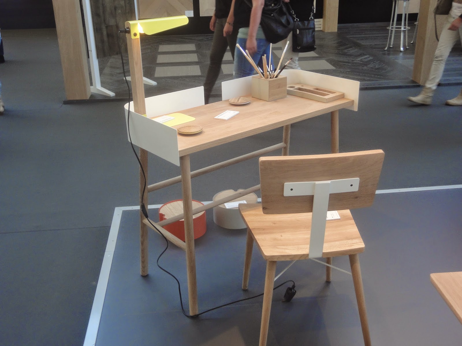
And my favorites brand was Universo Positivo. The combination of wood and metal is modern without being strict or harsh. Don’t be surprised if you find one of they’re products working there way into my home in the near future.


No comments:
Post a Comment
Leave a comment..